
🎬 Wuthering Heights – Complete Makeup Guide
(And Why It Looks So Real)
This is your complete tutorial guide, confirmed by the makeup designer and analysed by me based on colour theory.
Exact products used in the film
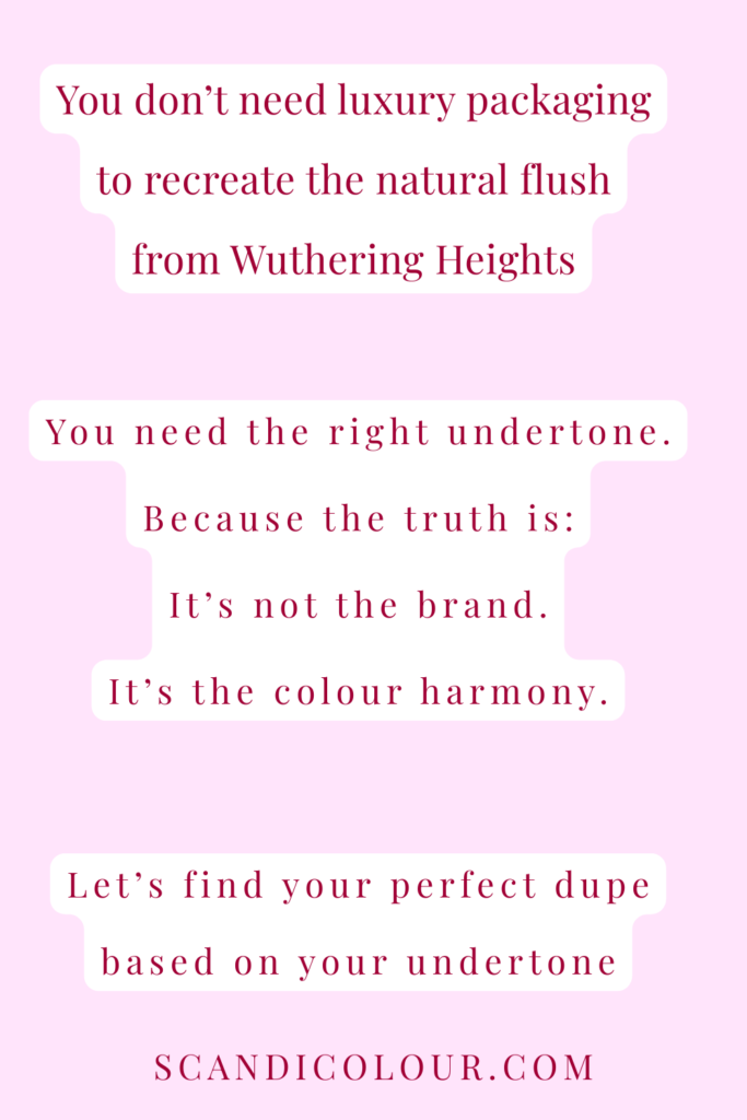
You don´t need all of these products (or any of them) to recreate this look – you just need the colour theory behind it.
In fact, it’s not the brand or the packaging – it’s the colour inside.
I have a complete shade guide with dupe rekommendations to recreate this look.
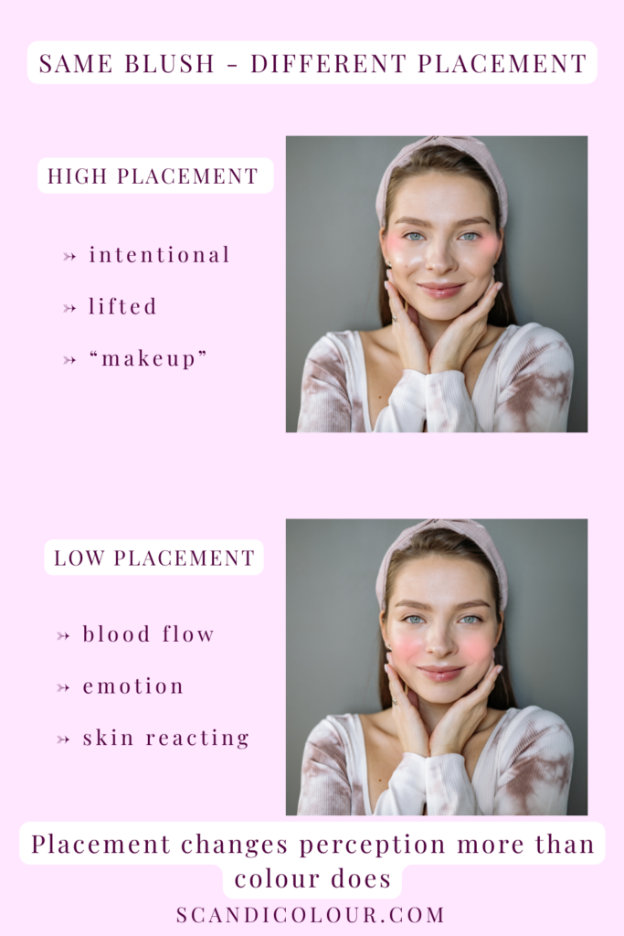
It’s not just blush. It’s placement + undertone + emotion.
In Wuthering Heights, Margot Robbie’s flush doesn’t look like makeup.
It looks like skin reacting.
That’s the difference.
Most people assume blush looks fake because of colour.
Usually, it’s placement.
Why This Blush Looks Real
There are four key reasons the flush works:
1. Low Placement = Skin, Not Cosmetics
When blush sits lower, it mimics where we naturally flush from cold, heat, anger or desire.
That’s why it feels believable.
2. Multiple Blush Tones Mimic Real Emotion
Real skin doesn’t flush in one colour.
In the film, you see variations like:
- Red berry → heat / anger / desire
- Cool pink → cold / embarrassment
- Muted mauve → grief / exhaustion
Layering tones (cream + liquid + powder) creates dimension — like actual circulation under the skin.
That’s why one flat blush shade often looks artificial.
3. A Skinlike Base Is Essential
A heavy, matte base would ruin this effect.
A thin, skinlike foundation allows colour to melt in and read as part of the complexion — not sitting on top of it.
The blush works because the base lets it breathe.
4. No Harsh Lines
According to Cosmopolitan, Margot Robbie’s makeup artist is very careful not to leave any harsh lines. She avoids this by going in with the foundation brush again to blurr out lines of the cream blush. After this she uses a powder blush to add dimension.
The Exact Colour Logic Behind It
🩷 Baby Pink = Innocence
For Isabella, the makeup artist described the shade as a perfect babydoll pink.
Baby pink mimics:
→ fresh blood flow
→ youth
→ softness
It signals innocence, not romance.
That’s a colour psychology choice — not just a trend.
Red berry to create a windswept flush
When Cathy lived at Wuthering Heights the makeup artist wanted her to look weather beaten and raw.
- Chanel No.1 Lip & Cheek Balm – Berry Boost
Pink + Mauve for a more sofisticated look
When Cathy moved to the Grange they wanted to represent a more indoor lifestyle.
- Rare Beauty Soft Pinch Liquid Blush – Happy (cool pink)
- Rare Beauty Soft Pinch Liquid Blush – Hope (muted mauve)
Pink brown + berry red for dept
Layering different shades of blush creates dimention and realism.
- Merit Flush Balm – Postmodern & Après
Lips (to keep it cohesive)
In the beginning of the movie the makeup artist used lip balms exclusively for a more realistic look. Later in the movie some lipstick was applied for the more dramatic looks on Cathy.
- Burt’s Bees Tinted Lip Balm – Rose
- Charlotte Tilbury Lipstick Pillow Talk
The key isn’t owning all of them.
It’s combining tones.
Cream blush underneath.
Powder blush softly diffused.
Affordable Alternatives – the Perfect Match for your Undertone
Different brands release almost identical shades — just with different logos and price tags.
KIKO Milano Blush Stick is the perfect dupe for Merit Blush Balm used on Margot in the film.
ELF Camo is a very good liquid blush option for the Rare Beauty one and the shades are very similar!
And most importantly – the right undertone + the right shade for you = natural flush.
The natural flush ≠ a universal shade.
Let’s break down what shades work the best for you, based on your undertone.
Important note: depending on your skin depth, you might want to choose a lighter vs deeper shade or adjust the intensity when applying.
COOL UNDERTONE (blue-based flush)
If your skin looks best in berry, rose or blue-red tones — you’re cool.
Luxury reference shades:
- Rare Beauty Liquid Blush Faith + Happy
- Merit Flush Balm Archival + Stockholm
Affordable dupes:
E.l.f Camo Liquid Blush
KIKO Milano Blush Stick
Cool undertones need depth without orange.
If a blush pulls peach on you — it’s not your fault. It’s undertone mismatch.
NEUTRAL UNDERTONE (balanced, soft)
If both cool and warm shades work — but overly bright shades overwhelm you — you’re neutral.
Luxury reference shades:
- Merit Flush Balm Cheeky + Beverly Hills
- Rare Beauty Believe + Worth
Affordable dupes:
E.l.f Camo Liquid Blush
KIKO Milano Blush Stick
- Geranium (leaning cool)
- Golden Sand (leaning warm)
Neutral doesn’t mean boring.
It means balanced harmony.
WARM UNDERTONE (peach, coral, golden)
If coral and orange-based shades make you glow — you’re warm.
Luxury reference shades:
- Merit Flush Balm Lusitano + Rouge
- Rare Beauty Liquid Blush Virtue + Love
Affordable dupes:
E.l.f Camo Liquid Blush
KIKO Milano Blush Stick
Warm undertones need warmth.
A blue-based berry can make you look grey instead of glowy.
The Formula
Same shade. Same formula (liquid or balm). Different logo.
It’s not the packaging.
It’s the colour inside.
Your undertone isn’t a trend.
It’s your blueprint.
Why Red Blush Doesn’t Stay Red on Everyone
It’s red in the pan.
But on skin?
It can turn orange, grey, dusty… or even clownish.
And no — it’s not just undertone.
It’s depth + saturation interacting with your contrast.
Most people think a blush “changes colour” randomly.
It doesn’t.
Your skin is modifying it.
Let’s break it down.
When red blush turns orange
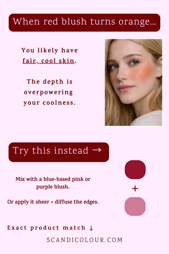
If a red blush pulls noticeably orange on you, you likely have:
- Fair skin
- Cool undertone
- Lower overall depth
The red isn’t wrong.
The depth is overpowering your coolness.
What to do instead
- Mix with a blue-based pink, purple or soft berry
- Apply more sheer
- Diffuse the edges before judging the shade
You don’t need a different vibe.
You need colour balance.
Exact shade example:
A blue based berry red (example: e.l.f Liquid Blush in Berry Well).
A cool toned pinky lilac shade (example: e.l.f Liquid Blush in Bold Faced Lilac).
Use separatly or mixed together for the perfect red based harmony.
When red blush turns grey or dusty
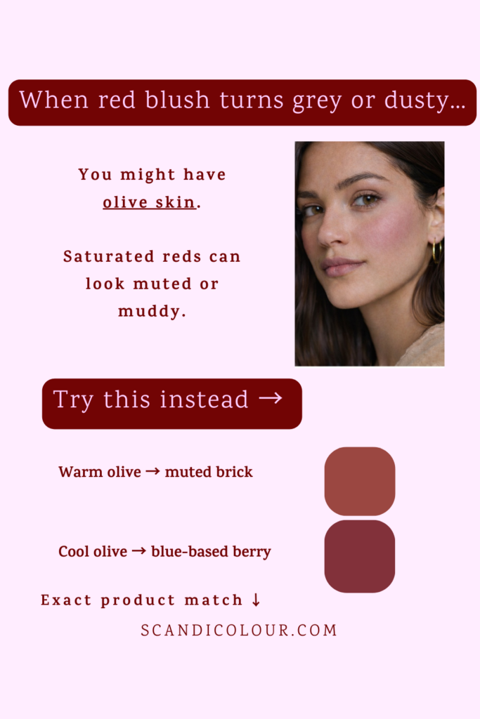
If the blush looks muted, muddy, or slightly off on you, you might have:
- Olive undertone
Highly saturated reds can clash with olive tones and lose clarity.
What to try instead
If you have a warm undertone a muted brick red is perfect for you.
If you have a cool undertone a blue based muted berry is more suiting.
Same concept.
Different harmony.
Exact shade example:
If you have a warm undertone a muted brick red is perfect for you
- Warm olive → muted brick red (example: e.l.f. Putty Blush Maldives).
- Cool olive → blue-based berry (example: e.l.f. Putty Blush Caribbean).
When red blush looks clownish
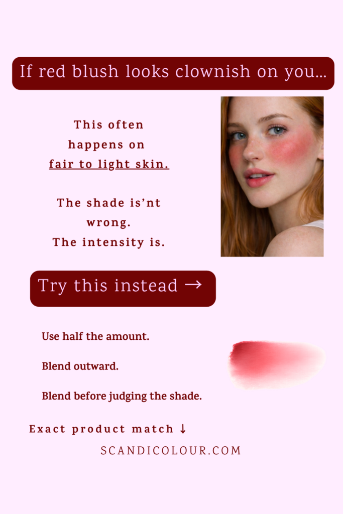
This often happens on fair to light skin.
The issue isn’t undertone.
It’s intensity.
The saturation is too high for your natural contrast level.
Fix it by:
- Using half the amount
- Blending outward
- Judging only after full diffusion
Placement and blending change perception more than most people realise.
Exact shade example:
A sheer, buildable and easily blendable red blush (example: lilybyred Luv Beam Cheek Balm).
When red blush disappears completely
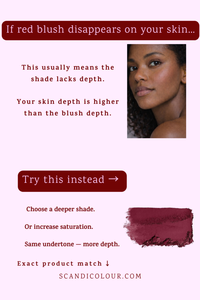
If the blush barely shows up, it’s not “too subtle.”
Your skin depth is higher than the blush depth.
What to do:
- Choose a deeper shade
- Increase saturation
- Keep the same undertone — just go richer
Depth mismatch is the most overlooked issue in blush selection.
Exact shade example:
A deep red shade (example: Nyx Sweet Cheeks Matte Blush in shade Red Riot).
The real reason it doesn’t stay red
Blush doesn’t exist in isolation.
It interacts with:
- Undertone
- Depth
- Saturation
- Skin contrast
That’s why the same shade looks:
• fresh on one person
• orange on another
• dusty on someone else
• invisible on deeper skin
It’s not the brand.
It’s colour harmony.
Not sure about your undertone?
Take the 30-second undertone test here →
Important
Some links are affiliate links, which means I may earn a small commission at no extra cost to you.
Shade Transparency
All shade assessments on this site are based on undertone analysis, brand imagery, ingredient composition, and comparative swatch evaluation.
However, undertone interaction is highly individual.
A product that appears cool-toned in pan or in official swatches may translate differently once applied to the skin due to:
- Individual undertone (cool, neutral, warm, olive)
- Natural lip or cheek pigmentation
- Surface redness
- Skin chemistry and oxidation
- Lighting conditions and application method
It is also not uncommon for shades marketed as “cool pink” or “neutral rose” to contain underlying warm pigments that only become visible once blended on the skin. In such cases, the shift is typically formulation-related rather than perceptual.
All recommendations provided here are analytical and guidance-based. Final suitability should always be evaluated in the context of your own undertone profile and previous shade experience.
When possible, in-person swatching is encouraged.